

This church family is vibrant and fun, and so would not suit a minimalist and grungey brand identity. We also needed something that would be easy for anybody to use as the brand is handled by so many different volunteers and staff.
We created a 30+ page brand document and have walked a long road of preparing staff and volunteers to use the colours, fonts, icons, photography, wording and a million other things that are often a nightmare without clear direction and strategy.
The solution, which is a fair expression of the church’s values, is a fun and colourful approach that mixes Swiss/international design with some funky retro elements.
The result is a pallette that is slightly muted, but still fun and diverse with mostly blues and greens along with some strong sans serif fonts expressed on a canvas of fun patterns that still leave a decent amount of negative space.
Beyond this, a guide to photography as well as training has been provided, ensuring that CCNC is well equipped to continue to grow the visual identity of the church for years to come.


This was after extensive communication about what the church stood for and what the church staff and volunteers needed in order to reach more people on the digital front. A significant portion of the branding process will always be strategic, with the discovery phase being especially important as we ask big question about the brand’s vision, mission, objectives and goals.
Brand Guide
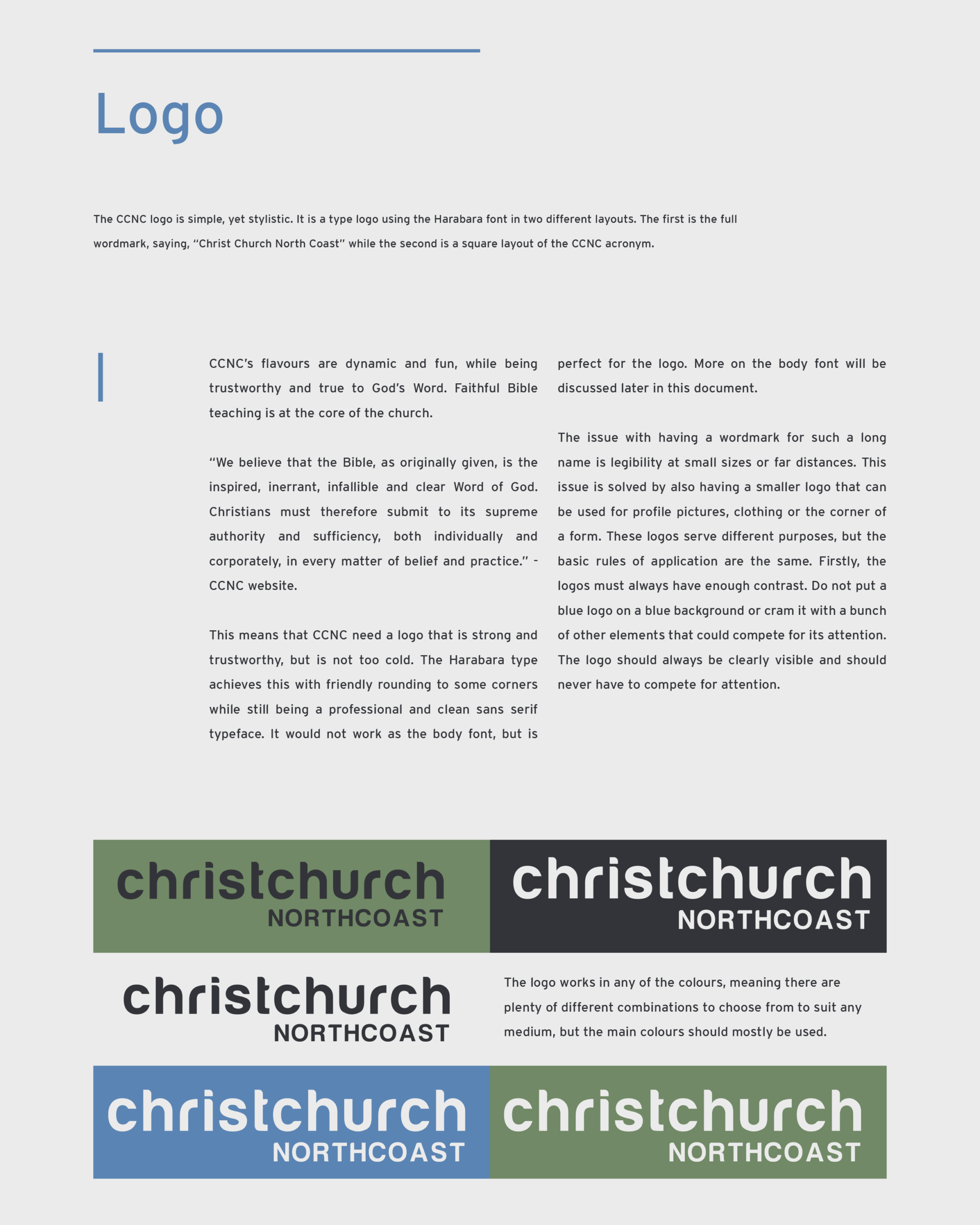
See the brand guide in its entirety to see what extent we go for our brands, making sure that every detail is considered.
Website
See the brand in action as a website. It’s consistent through and through.