The Narwhal
For: That Brewing Co. + Stumpnose
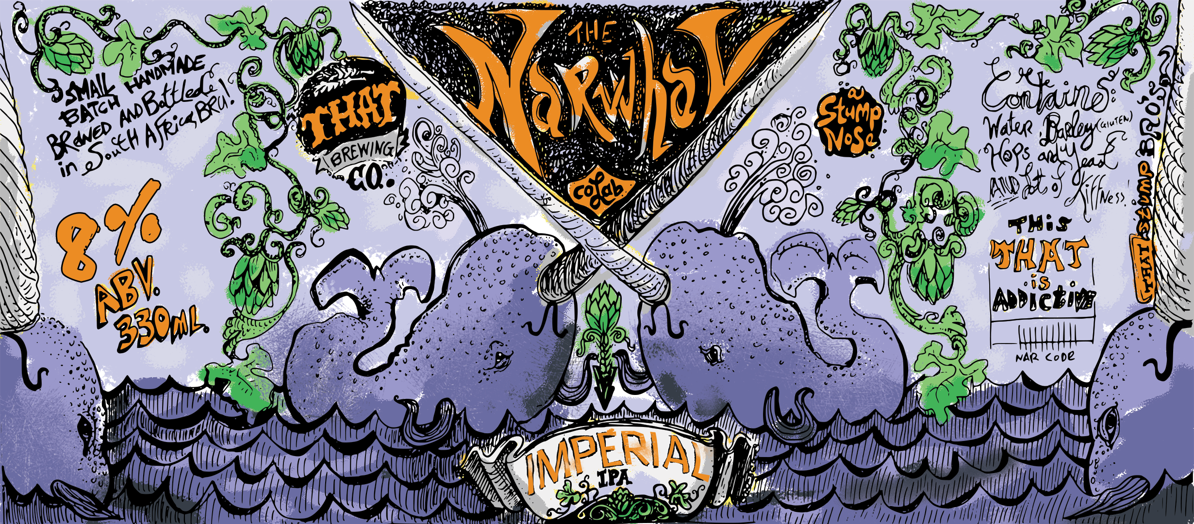
The Narwhal is a collaborative beer between Stumpnose and That Brewing Co. It’s an Imperial IPA, which happens to be my favourite beer style. We needed something bold and exciting to suit this hoppy masterpiece that won its division in the Clarens Beer Fest. We started off with a sketch by Travis O’Sullivan and worked from there.
Step 1 was to vectorise the sketch. We then had a vector graphic with thousands of nodes. Of course, tracing a bitmap is never going to be perfect, so then started the very slow process of sculpting detail back into the sketch. We then followed that up by bringing the vector into Photoshop and painting colour behind it, opting for a pastel look with loads of texture to it. The breweries gave loads of freedom in terms of colour and typography and so we leaned heavily into oceanic blues paired with a fiery orange.

My Cherry
For: Robson’s
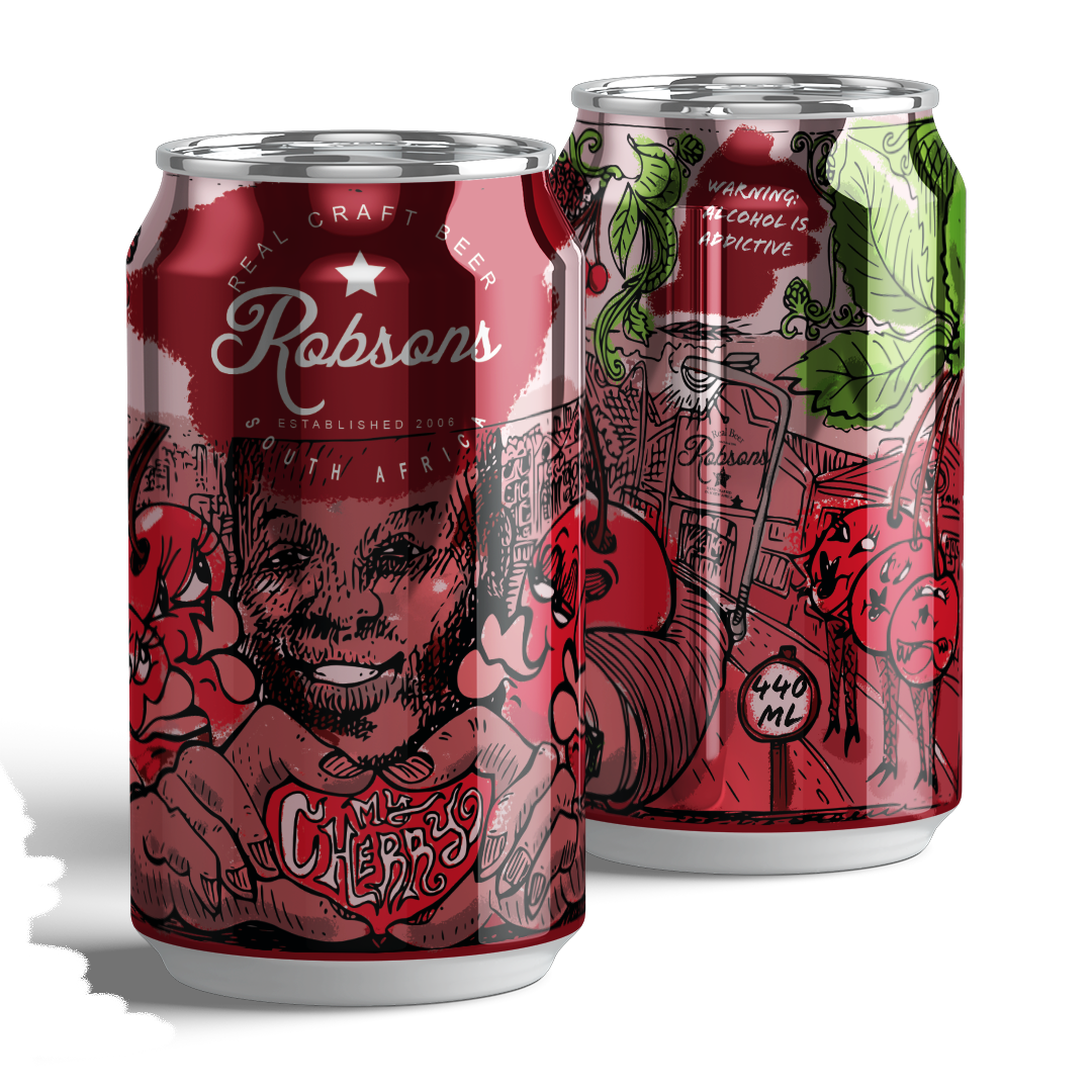
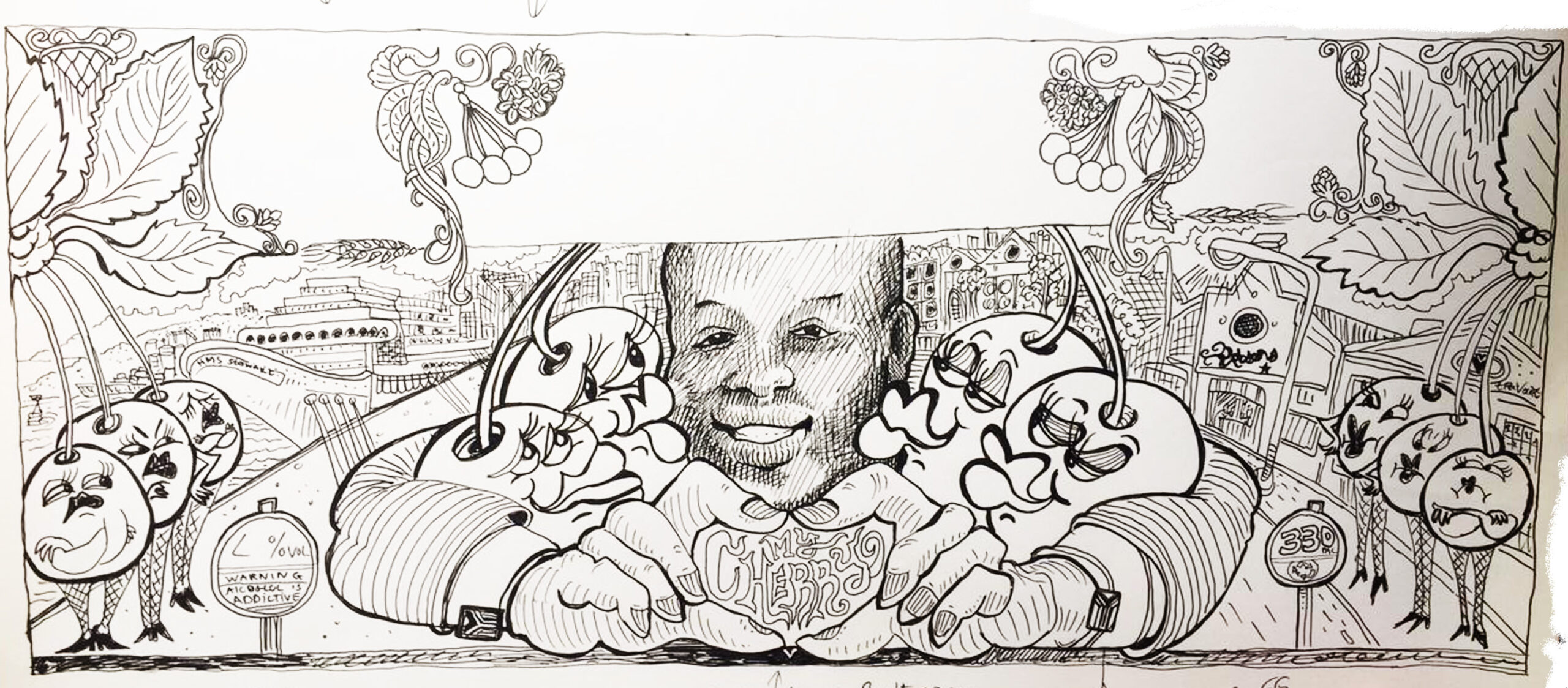
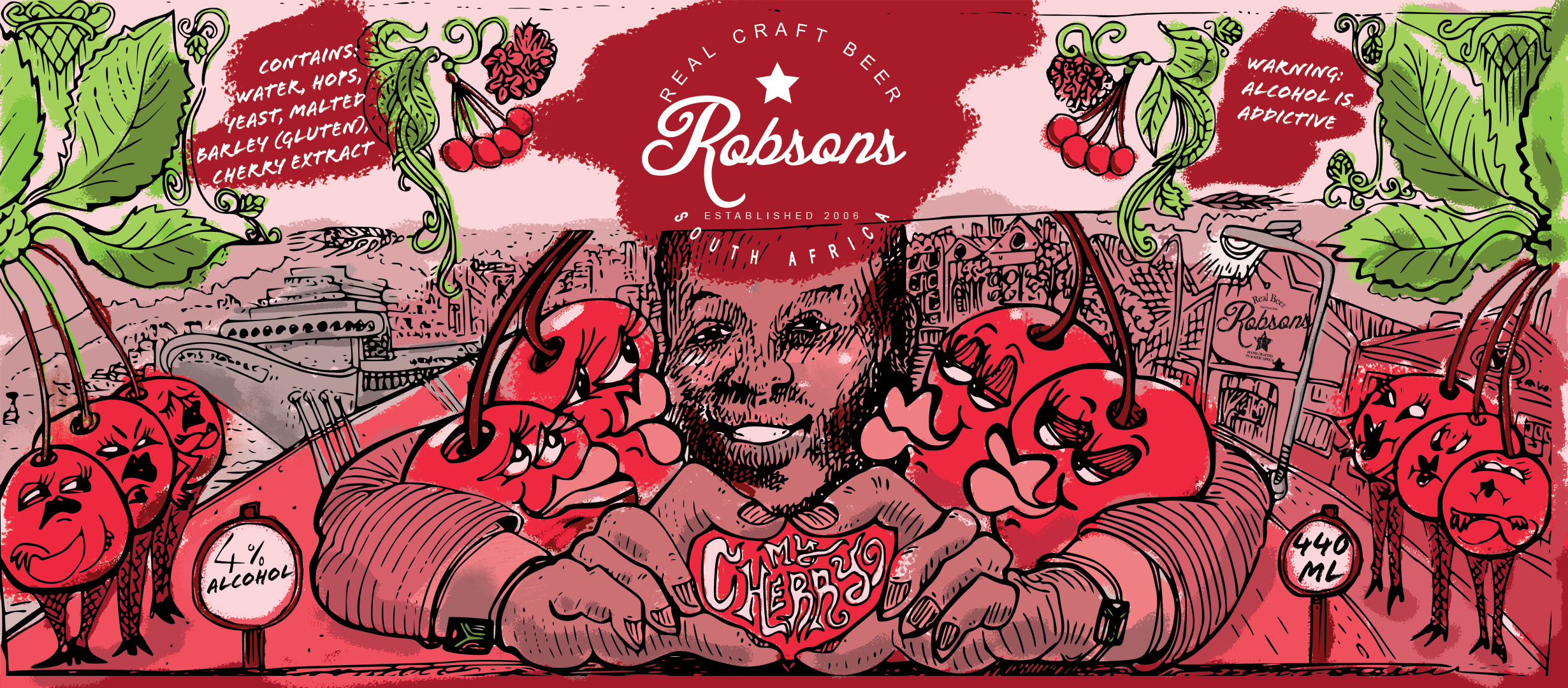
Robson’s made this fun Cherry beer that needed a fun label. Again, Travis did great linework that then needed to be digitised and then coloured.


We opted for different shades of pink and red paired with green for the hop plants. Most colours are just shades of the same pink, which ensures that the design maintains harmony throughout.
These projects are a great example of physical mediums meeting digital as well as how us brand designers need to meet clients where they’re at to reduce pain points in putting out beautiful projects so that they can focus on what they’re good at (in this case, that’s making tasty IPAs).
